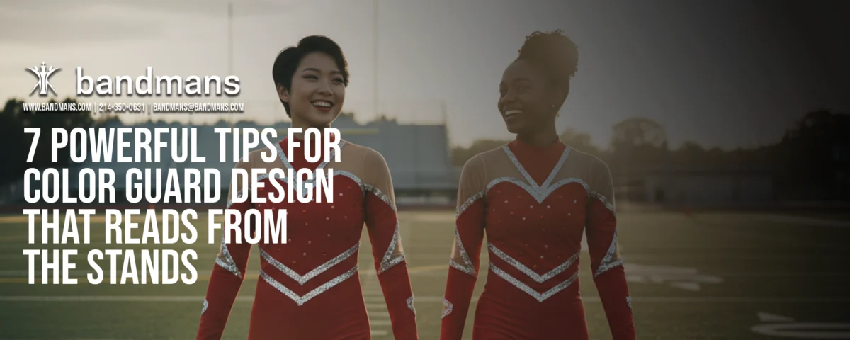

7 Powerful Tips for Color Guard Design That Reads From the Stands
Color guard can be doing the absolute most on the field—huge tosses, fast exchanges, intricate body work—and still not fully “land” if the audience can’t instantly understand what they’re seeing from 100 feet away. From the stands, people don’t catch every micro-detail; they catch shapes, timing, contrast, and emotion. It’s clarity + impact: making sure your best moments read big, hit clean, and feel intentional—so the crowd reacts and the story comes through without anyone needing to “figure it out.” In this blog, we’re breaking down 7 powerful tips that help you design guard moments that pop visually, guide the audience’s eyes where you want them, and keep attention locked from the first count to the final picture.
Understanding the fundamentals of Color Guard Design is essential for creating captivating performances.
1) Design for “readability” before you design for difficulty
Effective Color Guard Design requires careful attention to detail and audience perception.
If the audience can’t tell what just happened, it doesn’t matter how hard it was. Start with big, clean ideas:
clear shapes
obvious phrase endings
strong unison moments
readable focal points
Power move: ask, “If I watched this with no music, would I still get it?”
Incorporate elements of Color Guard Design that enhance visibility and audience engagement.
2) Build your show around “picture moments” (not constant motion)
When planning your show, consider how Color Guard Design can create memorable visual moments.
A show that never breathes becomes visual noise. Instead, plan intentional snapshots:
a bold opening picture
2–3 mid-show “stand and scream” moments
a final picture that feels inevitable
These are the moments audiences remember and judges can clearly reward.
Integrating strong Color Guard Design principles can elevate your performance and connect with the audience.
3) Use staging like a camera director
Utilizing effective Color Guard Design strategies can transform your routine into an unforgettable experience.
Think of your color guard in layers:
Foreground: who’s featured right now
Midground: who supports the story
Background: who creates texture or motion
If everyone is doing everything, nobody is featured. Give the eye one obvious place to go.
4) Color is a weapon—keep your palette intentional
Color Guard Design should always reflect the emotions and themes of the piece being performed.
one dominant color family per major section
intentional contrast for impact moments
avoid “random rainbow” unless it’s the concept
Quick test: can you describe your show’s palette in one sentence?
5) Match equipment choice to the emotional beat
Pick equipment the same way you’d pick instruments in an arrangement:
flags = sweep, flow, big readable motion
rifles = precision, punctuation, accents
sabres = intensity, edge, high-stakes energy
Make equipment changes mean something. If the switch doesn’t change the feeling, it’ll just feel busy.


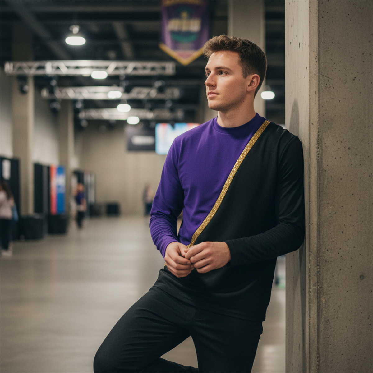

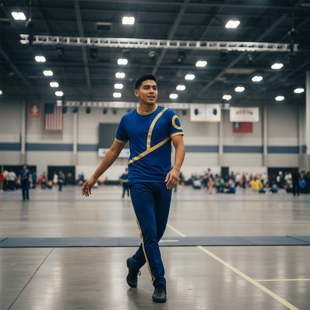

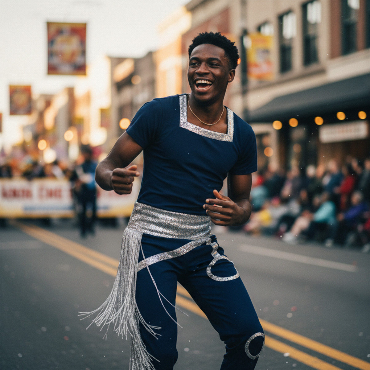

From stadium lights to parade routes, Bandmans outfits the performers who bring the energy. Whether you’re marching band, drum corps, color guard, or majorette, our uniforms are built to move, built to last, and built to make a statement—clean lines, bold color, and performance-ready comfort in every detail. Because when your team steps on the field, the look should hit just as hard as the show.
6) Choreograph for distance (bigger body, clearer pathways)
Strong Color Guard Design can turn ordinary performances into extraordinary spectacles.
Micro-details don’t read from the stands. Prioritize:
strong body lines (clean angles, clear silhouettes)
travel that creates visible pathways
tosses/releases placed where they’re actually seen
Design tip: treat the field like a stage—center and diagonals are your best friends for readability.
7) Teach performance quality into the design (not after)
Make sure to review all aspects of your Color Guard Design for maximum impact.
Performance isn’t frosting—it’s the cake. Write moments that require expression:
breath cues
eye focus shifts
moments of stillness that force presence
musical accents that demand projection
If you wait until February to add performance, you’ll always feel behind.
Teach your performers about Color Guard Design to enhance their understanding and execution.
Mini “Stand Test” Checklist
Before you lock the show, answer these:
Can the audience identify the feature point within 2 seconds?
Do your biggest moments have space to hit?
Are transitions readable, or do they blur?
Does the last 20 seconds look and feel like a finale?
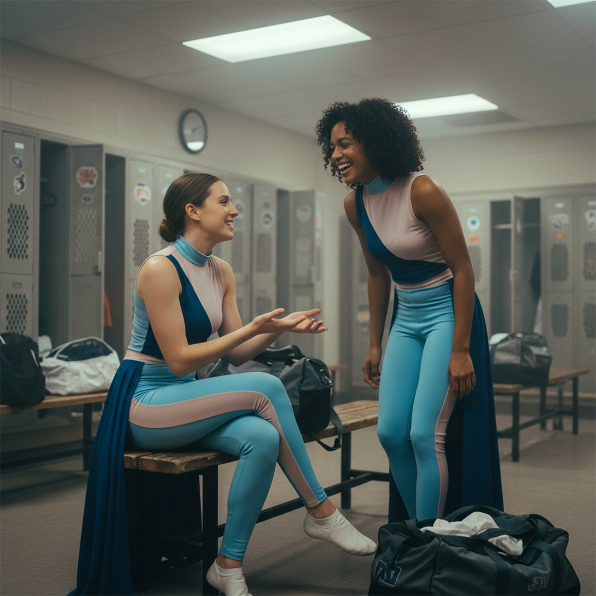

Want your show to look premium on the field? A consistent, intentional uniform and performance-wear look helps the whole production read cleaner—especially at distance. Explore various styles and techniques to enrich your Color Guard Design and performance aesthetics. Shop our color guard uniforms below!
References & Outside Resources
Always keep the principles of Color Guard Design in mind during rehearsals and performances.
- WGI Rules: https://www.wgi.org/rules/
- WGI Educational Downloads: https://www.wgi.org/wgi-educational-downloads/
- WGI 2025 Color Guard Adjudication Manual & Rulebook (PDF): https://www.wgi.org/wp-content/uploads/2025/02/2025_WGI_ColorGuard_AdjManual_Rulebook.rev-Feb-11-25.pdf
WGI 2024 CG Contest Rules (PDF): https://www.wgi.org/wp-content/uploads/2023/09/2024-CG-Rules.pdf
Color Guard Design must be tailored to fit the narrative you wish to convey on the field.
